Cart


Redesigning Vive España to clarify students’ journeys
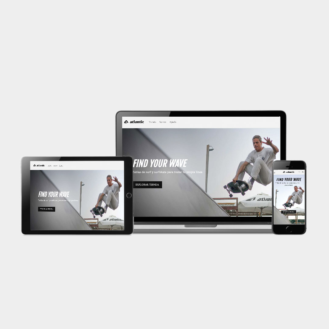
As Lead UX Designer & Researcher, I took on the challenge of overhauling an existing information portal for international students. My mission was to transform a confusing, text-heavy site into a clear, guided experience—so users could effortlessly navigate program options, understand visa steps, and secure housing without dropping off. This project set the stage for every insight and design decision that followed.
When user paths break, everything else falls apart—almost 50 % were abandoning before booking a free consult. We set out to:
Through a tightly choreographed design sprint, we ran every step through the user’s lens:
-v2.jpg)
Our data painted a clear picture of pain points:
Addressing each insight, we crafted a cohesive journey:
.gif)
The redesign moved the needle across the board:
This project reinforced that guiding users through bite-sized steps—with the right cues at the right time—drives both confidence and completion. Embedding quick feedback loops early not only catches hidden friction but also keeps the team aligned on genuine user needs.
I’m now focused on weaving dynamic, profile-driven guidance into future flows (think adaptive tooltips and tailored testimonials) and piloting an AI-powered FAQ assistant for on-demand visa and housing support.
Redesigning Vive España to clarify students’ journeys
As Lead UX Designer & Researcher, I took on the challenge of overhauling an existing information portal for international students. My mission was to transform a confusing, text-heavy site into a clear, guided experience—so users could effortlessly navigate program options, understand visa steps, and secure housing without dropping off. This project set the stage for every insight and design decision that followed.